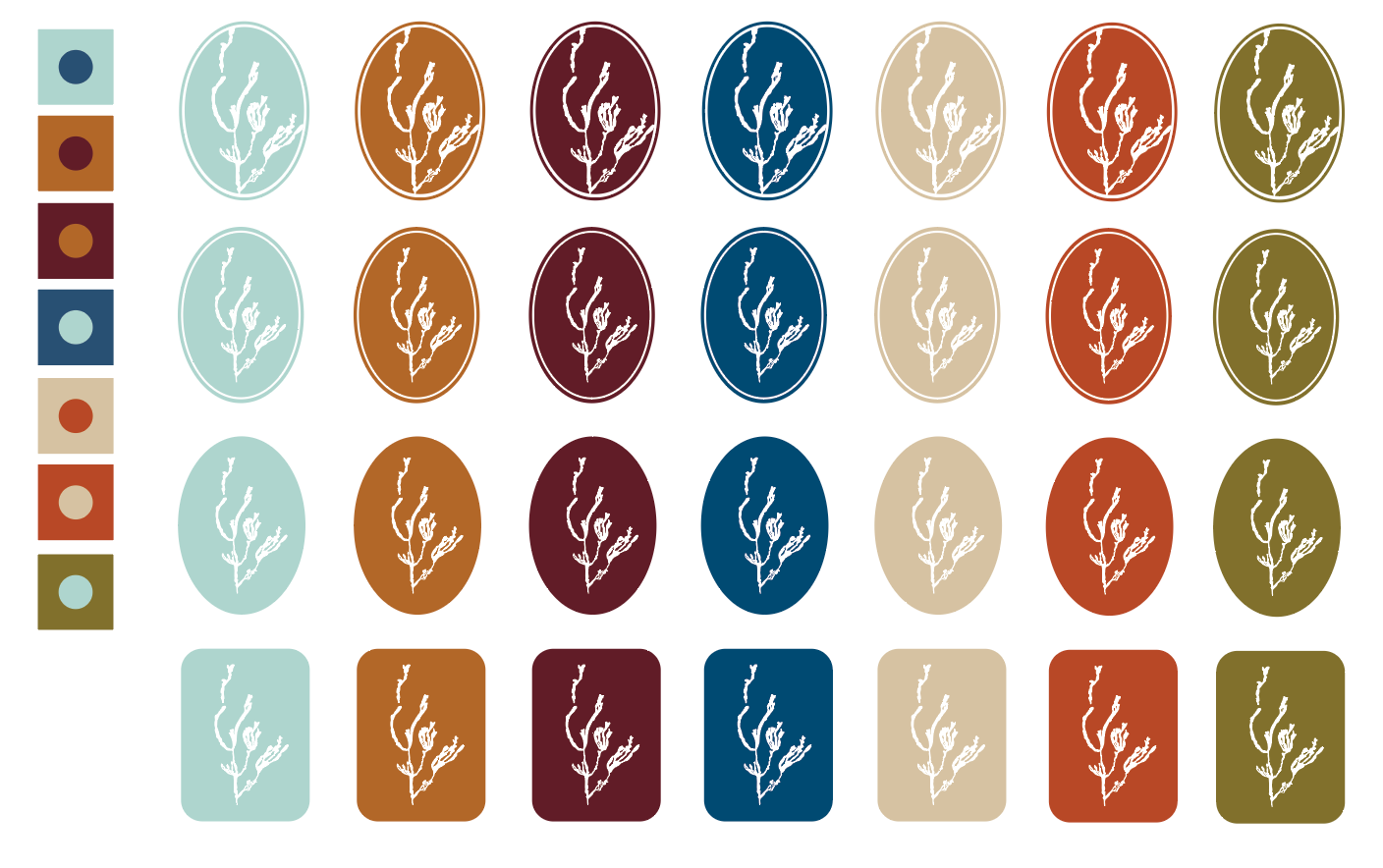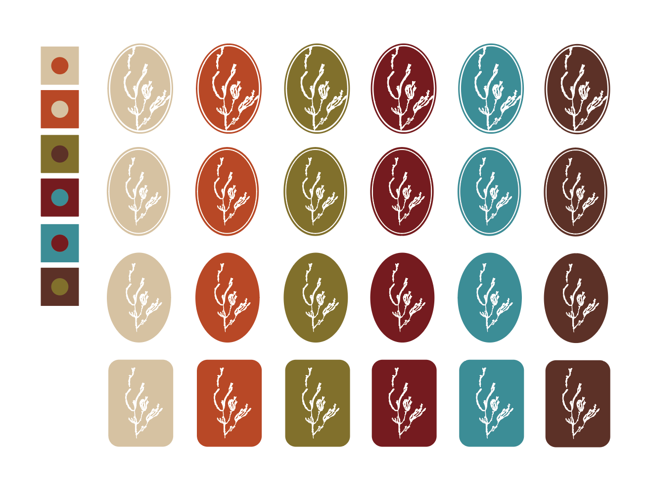
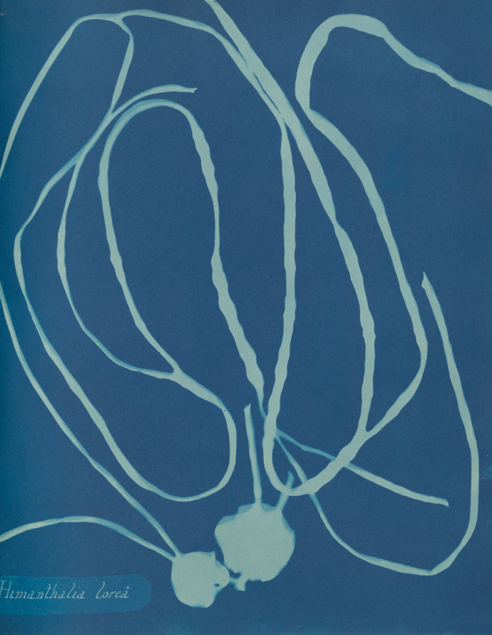
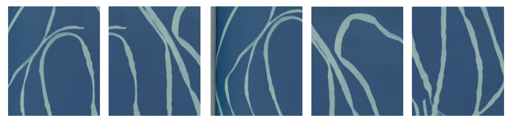
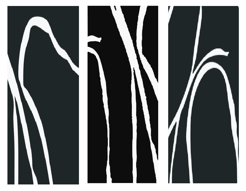
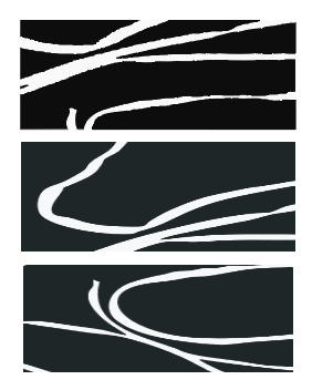
The branding for Kindred & Co draws inspiration from the natural beauty of San Juan Island, WA. At the heart of the concept are found cyanotypes of kelp, which capture a delicate balance between land and sea. When abstracted, the shape of the kelp is ambiguous; looking like both florals found on land and kelp found in the sea. This speaks to the nature of Kindred & Co.'s story which is creating experiences in harmony with the San Juan Island's environment.
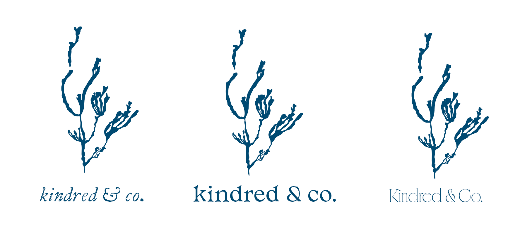
These organic shapes and deep, natural tones informed the design of the logo and its iterations, reflecting both the elegance and the intimate nature of Kindred & Co’s events. The branding aims to evoke a sense of connection—to the land, to the sea, and to the shared moments that make each event unforgettable.
Found Cyanotypes
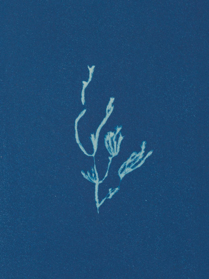
Cyanotypes Abstracted - Iteration 1
Cyanotypes Abstracted - Iteration 2 & 3
Logo 1 - Iteration 1
Logo 1 - Iteration 2
Logo 1 - Iteration 3/4/5
Logo 1 - Color Palette Testing